Project Brief
This project involved designing and creating physical packaging for the re-launch of a product. I chose to re-brand Aesop for this project. I also considered the ambition of my choice, recognising that while bottle labels or cans might present minimal challenges in creating mockups, incorporating more complex packaging elements, such as a set of products or extra packaging would better demonstrate my skills.
About the brand
Aesop is a luxury skincare, globally recognised brand. They are industry leaders in terms of corporate ethics, commitment to excellence and design, and product quality, however, their greatest asset is the unity in concept and value. Utilising strong minimalist design and sleek aesthetic, the Aesop brand embodies the values of beauty, luxury, and design. Although Aesop utilises many plant-based ingredients, they do not position themselves as a ‘natural’ brand, stating that a combination of natural and man-made ingredients produces the highest-quality products for skincare.
New brand direction
Although Aesop has a unique brand identity, and its design aligns with its current brand values I felt that the branding lacked character and individuality. I sought an opportunity to elevate the brand by creating exciting visuals for the packaging of their products. For this project, I proposed a new branding direction for Aesop. The brand will continue to reflect luxury and minimalism. However, they will undergo a shift towards entirely natural-based formulas. This change stems from the growing consumer demand for eco-friendly and sustainable products. Customers want their favourite brands to step forward and make a positive impact. Ultimately this change will keep their current customers, attract new ones, and position the brand as a forward-thinking industry leader.
The current branding of Aesop doesn’t represent this change. I aimed to incorporate more nature-inspired designs and colours that would be visually exciting and reflect their new dedication to sustainability.
Concept
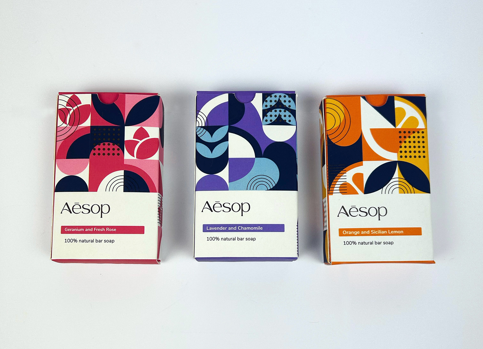
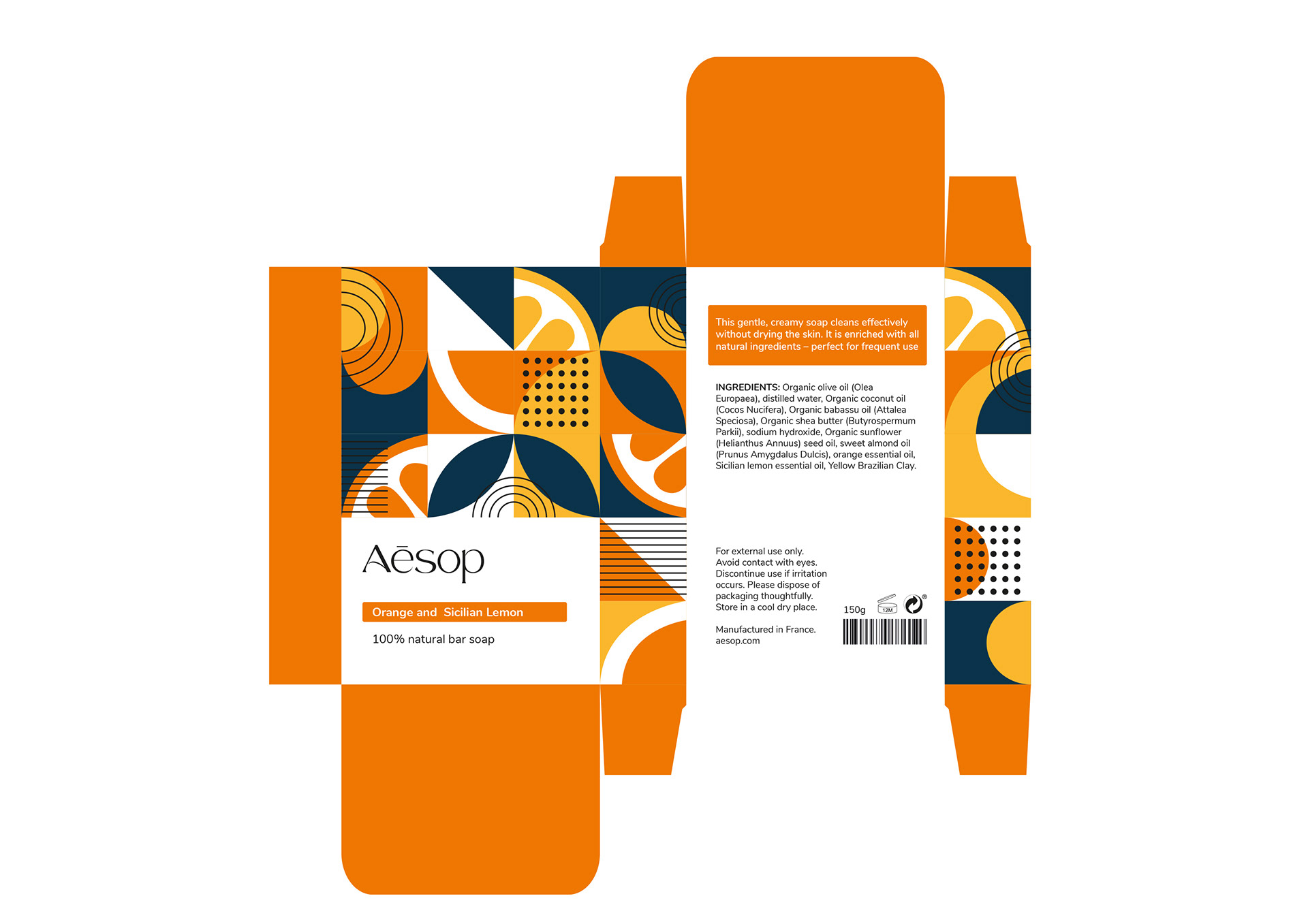
The geometric pattern emerged as the most compelling and appropriate direction, derived from the research process. The new shift towards natural ingredients and prioritising sustainability required visuals that would resonate with these new priorities and values. Research into geometric shapes and patterns revealed that they are seen in much of nature, therefore geometric shapes were created to represent each of the soap bar scent ingredients.
Materiality
Incorporating gold foiling was decided in order to accentuate the premium quality of the bars. My initial idea was to foil selected parts of the shapes, however, decided this approach would not give the desired effect as I felt using coloured foil that matched the packaging risked it appearing tacky and cheap, detracting from the overall desired aesthetic. Therefore I decided to incorporate additional elements such as dots, lines and curves as overlaying shapes to be foiled in gold. By intertwining with the pattern they aim to reinforce the luxurious aspect of the packaging.
Series design
In refining the series designs, research into the colour navy suggested that it commonly carries a meaning of royalty, luxury/lavish feel and can communicate a high-end look. Especially when paired with metallics such as gold or silver, making it an ideal choice for elevating the visual appeal of the soap bars. A choice of navy blue as a standard colour throughout created a more cohesive design set but also allows each bar to maintain its individuality.
Read the full design process below