Overview
This is a project that I worked on as part of the Real Job Scheme. The client was the Manuel Bravo Project, a free legal representation for asylum seekers and refugees based in Leeds. The organisation recently had a rebrand of their logos and letterheads, causing them to look for new physical outputs to help enhance the new branding. There are two different branches of the Manuel Bravo Project – In-house and Outreach. They are aiming to look for ways to appeal directly to these different target audiences.
Restated brief
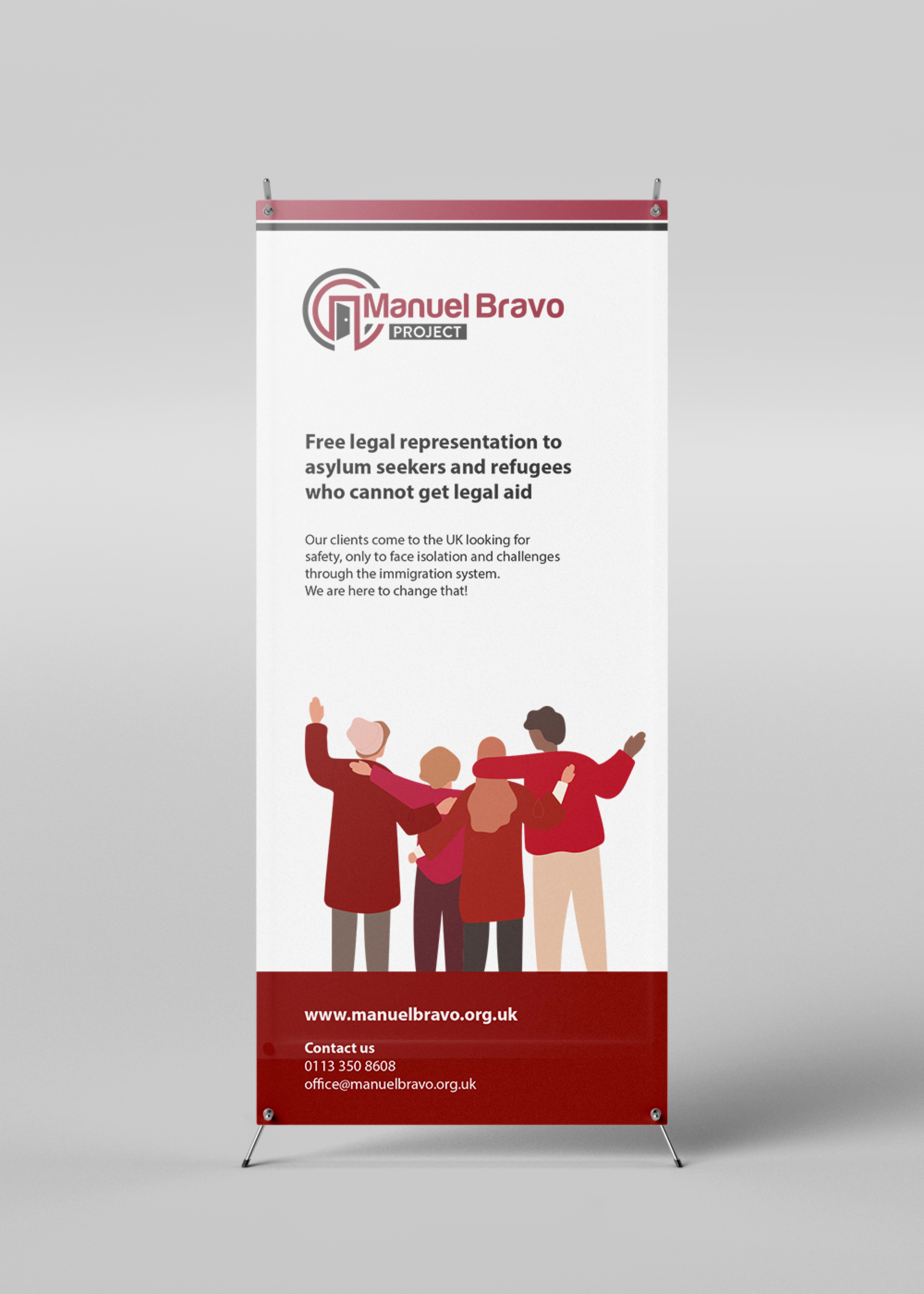
The client originally requested two leaflets to appeal to their separate target audience; In-house and Outreach. However, we suggested to help raise further brand awareness, therefore by having a physical banner, it would be a useful output for the organisation can use at charity events to help draw in new support and clients.
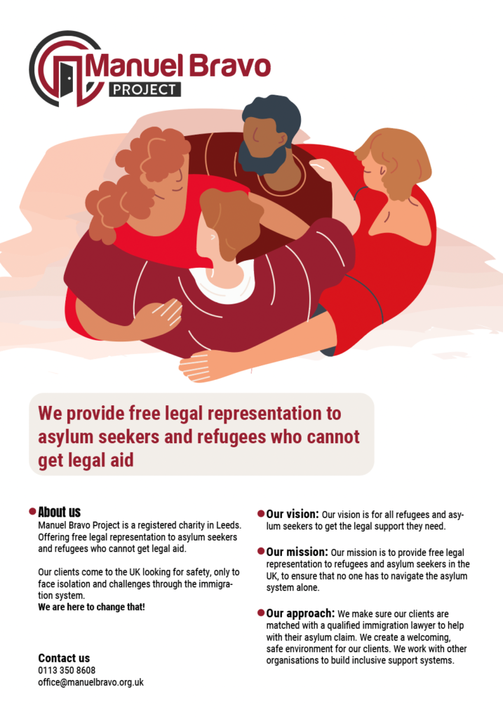
Due to the organisation’s two branches, our client wanted us to incorporate the different brand colours within the leaflets, to ensure the correct information is being received. With their green colour symbolising the Outreach audience, and red for the In-house casework audience. Our client has distinct target audiences – clients who are often new to the country with limited English, corporate/funder audiences who need to know a bit more about our background, and volunteers/partners who we recruit to help them with their work.
Research
The first stage of the project began with research to understand the Manuel Bravo Project. We used information provided by the client as well as their website to gain a thorough understanding of the charity’s background and its mission, vision and core values. We identified that our main target audience was those who spoke minimal English and therefore knew our designs needed to cater to this. However, we also recognised a secondary audience such as volunteers and donators, so we wanted to make sure our design resonated with both demographics.
During the research process, we analysed various charity leaflets for inspiration. We noted that many of them tended to be overcrowded with information, potentially overwhelming for the readers. This was something we needed to avoid especially with our primary target audience. We aimed to structure the leaflets in a way that prioritised clarity and ease of understanding, by focusing on hierarchy and simple messaging.
Designing
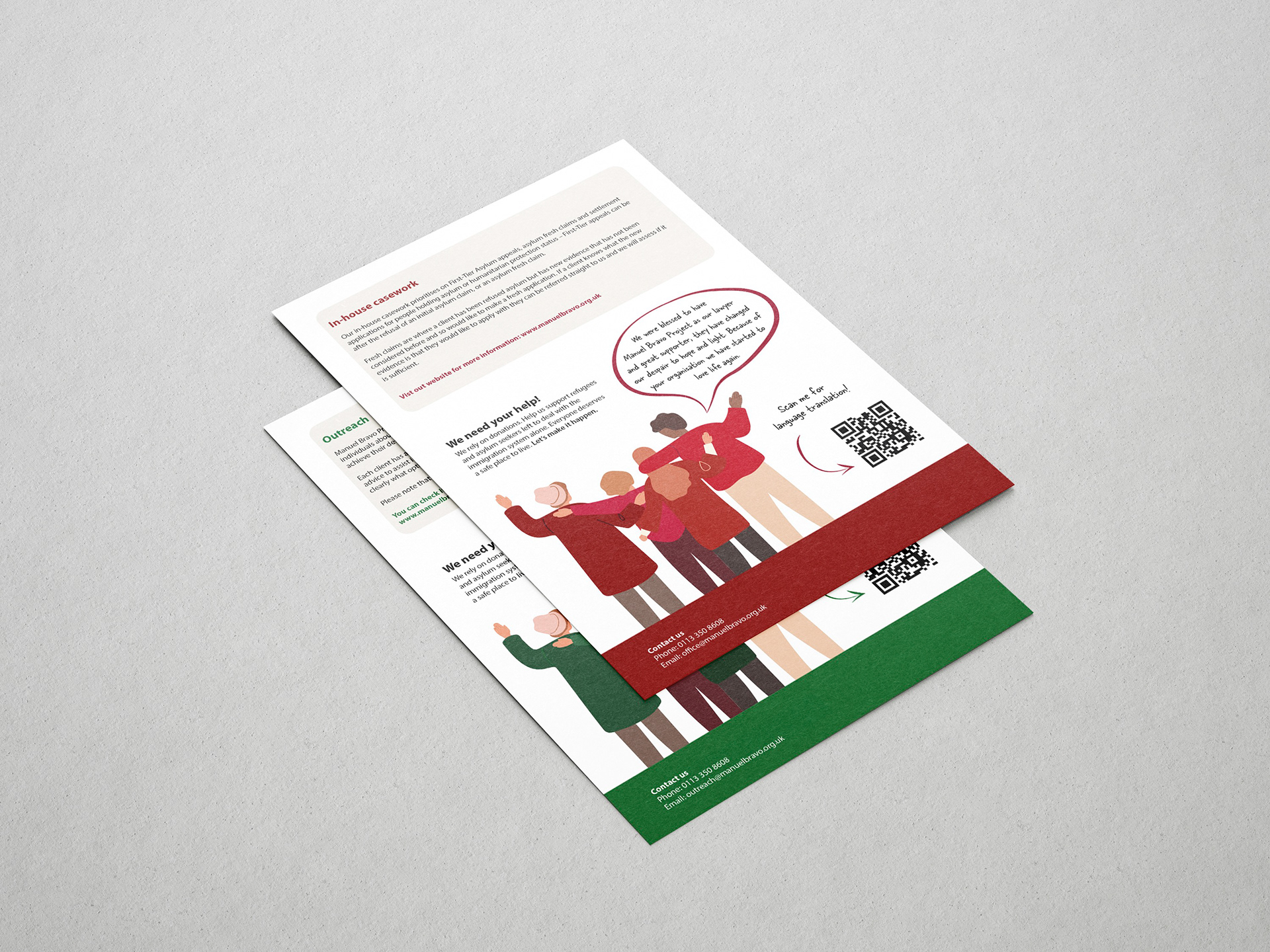
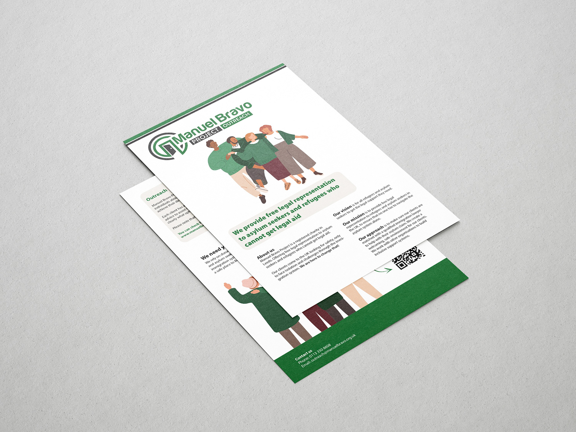
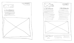
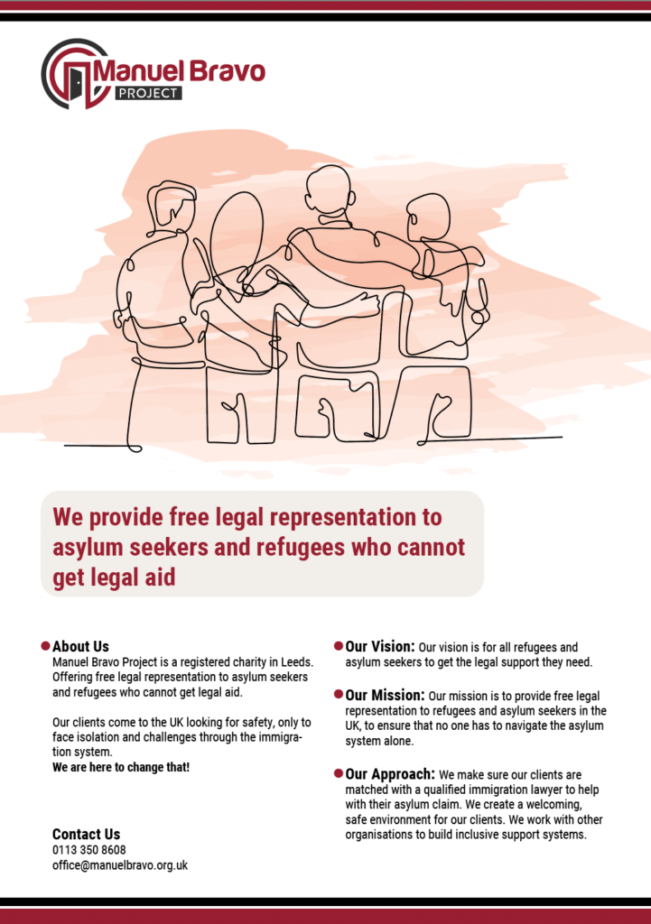
We commenced the design process by experimenting with various leaflet styles through sketches, considering different layouts. After visualising each exploration, we opted for a simple double-sided A5 leaflet design. We felt this choice was best suited for its intended target audience, as there was no complexity of what pages of the leaflet were to be read first. Our client agreed with this decision and during a feedback meeting with him, we further discussed his favoured options for text and image placement.
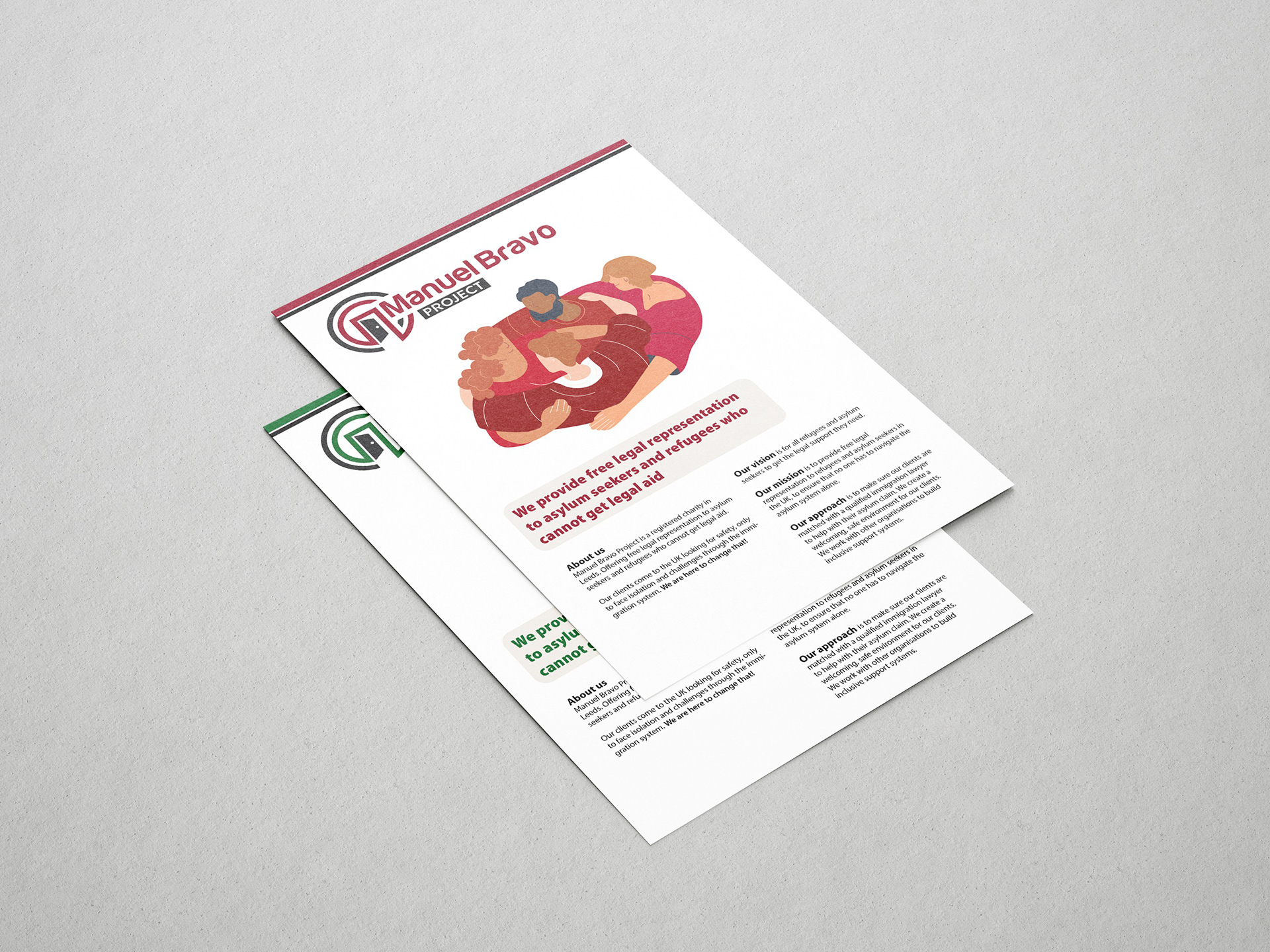
On the front of both leaflets, we highlighted the charity’s mission, vision, and approach as well as a concise overview description. For the back of the leaflets, we tailored the content more specifically to each branch of the organisation – In-house representation and Outreach services.
Furthermore, to address the main target audience, we thought it would be useful to enhance the accessibility of the leaflets for those whose first language isn’t English. We proposed the idea of a scannable QR code translator on both leaflets for users to access relevant information and resources in their chosen language.

Leaflet and banner sketches
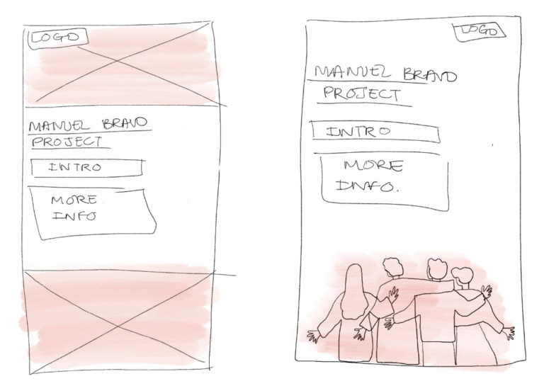
The banner was designed after the leaflets were finalised. Initially, we struggled with how to represent Manuel Bravo in a banner format. The real jobs meeting was extra helpful during this stage of the design process as tutors and peers helped us refine our banner design. We focused on maintaining consistency with the leaflet designs by carrying over key design elements such as typography and illustration style. One of our illustrations was adjusted to sit perfectly on the banner and it was able to fill in white space that we initially struggled with.
Meetings with the client and the real jobs team helped us guide our design decisions to create the most effective designs. The client was helpful in providing minor tweaks for us to change throughout the project.
Imagery
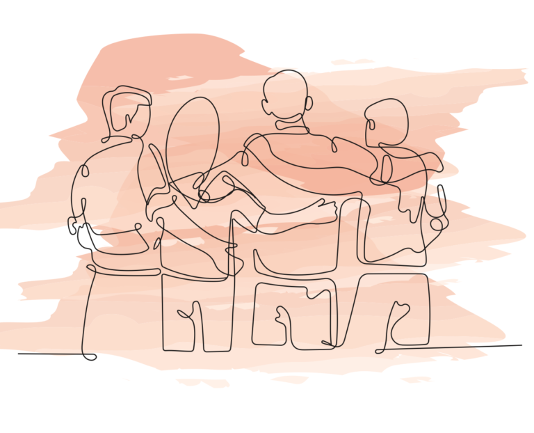
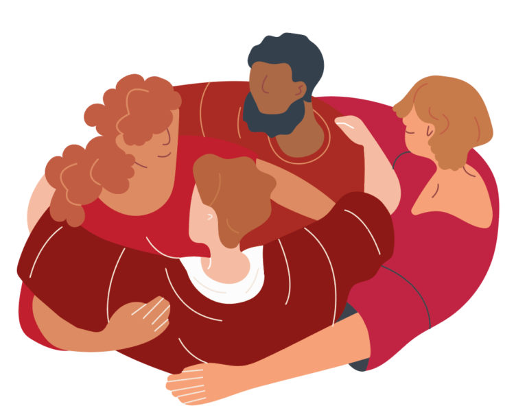
We created engaging and unique illustrations to present on the front and back of the leaflets. The illustrations allowed us to depict diverse characters. The characters on each leaflet wear the corresponding colour attire to reinforce the differentiation between the different branches of the organisation and to maintain brand consistency.
We opted for illustrations over photography, as the organisation wanted to move away from the photography direction. Having previously used images of Manuel Bravo himself in promotional materials, it felt inappropriate to them to plaster his image all over their outputs and social media. Our illustrations provided a more respectful alternative and maintained privacy and sensitivity.


Copy
While specific body copy was not provided to us by the client, we took the initiative to select words that we felt best represented the Manuel Bravo Project’s ethos. Drawing from our research and understanding of the organisation, we chose messaging that we felt was most important to display and we are confident that our banner design will help Manuel Bravo Project raise awareness and gain additional support.

Final outputs
Due to the client being based in Leeds, we weren’t able to see the deliverables go to print. To reduce printing costs we, sent our client print-ready PDFs of each of our deliverables. To help the client we also provided them with rough estimates of the print production costs from CPS. To help the client visualise our leaflets and banner designs, we provided him with mock-ups to showcase the final deliverables in their potential environment.