Brief
We were tasked with creating a coherent brand identity for the Undergraduate BA Graphic Communication Degree Show. The show aims to display and showcase the graduating students’ work through engaging design material that effectively promotes the degree show. The design of the show should symbolise the graduating year group and their time at the university. Additionally, by using a diverse range of media to promote and showcase the event enables the graduating students to gain exposure to emerge into the professional world.
I was chosen to be a part of the Degree Show team. It was both an honour and a privilege, especially since it was my own degree show. My primary role within the Degree Show team involved helping with the ideation process for the show's theme and visual identity as well as leading two of the design outputs. We began by researching previous degree shows to understand their successes and areas for improvement. Drawing inspiration from past themes and incorporating fresh ideas, we aimed to create a show that would stand out and reflect our unique experiences as the graduating class of 2024.
Branding
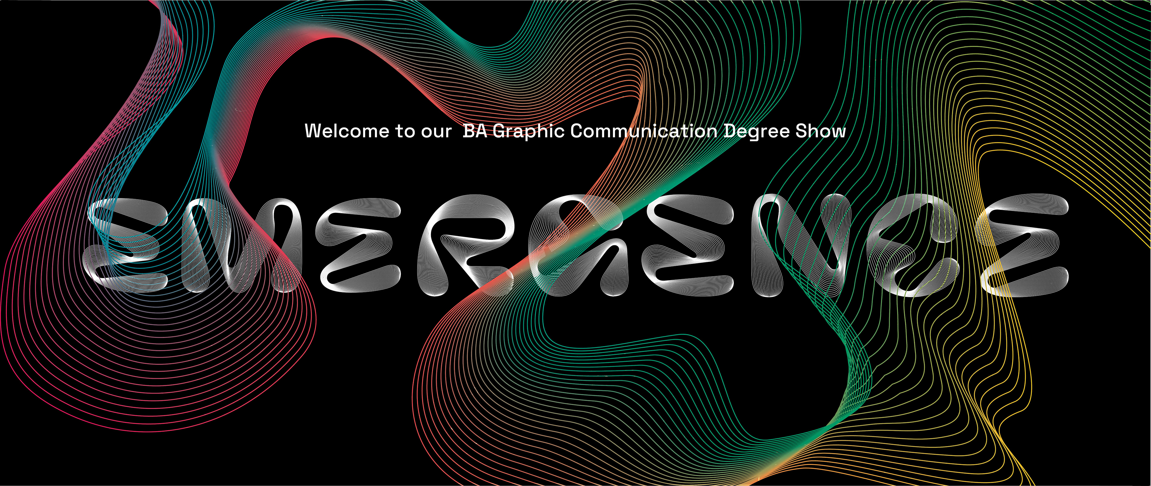
After extensive brainstorming sessions and collaborative discussions, we decided on the name "Emergence". The name captures the essence of our transition from academic study to the opportunities of professional life. "Emergence" symbolises growth, new beginnings, and our potential as designers ready to make an impact in the industry. It perfectly encapsulates the journey we have undertaken and the exciting future that lies ahead of us.
In terms of design, we focused on creating visuals that portrayed the concept of emergence effectively. Creating the branding was a challenge, as it entailed developing visuals for an abstract word. Through multiple rounds of ideation and feedback, we were able to hone in on our final look and styling of the branding. There are two main elements that make up the branding; the type and the shape weaving through it, both with blend effects to emulate a halftone style. The reason for using this kind of style stemmed from a feedback session with our supervisor, who presented the idea of using different types of halftones, which related to the word ‘Emergence’ in the sense that halftones are used to make up an image, hence making it ’emerge’ from the combination and spacing of dot patterns, originally. Rather than using the traditional CMYK halftones, we experimented with using lines of the same colour to replicate this.
The display type, 'Pilowlava' was chosen for its uniqueness, and its relation to energy, which is a callback to the first themes we thought of when deciding on a name for the show; 'Pilowlava' seeks a balance between viscous energy and controlled geometry. We discovered a blending effect that made the letters have evenly spaced lines. Due to the drastic variations and inconsistencies of the glyph structures, applying this effect meant that the lines would converge and disperse at various places, adding interest to the type.
In terms of the colour used, we adapted the CMYK palette with an added green. This was done to give us bright colours that would stand out, and we wouldn’t have to worry about them being dulled down when printing. We also decided on a black background, as the blend effect translated better this way and felt brighter than dark on a lighter background. To ensure that our colour choices would work well for print deliverables, we did multiple test prints to ensure that the colours were as bright physically as they were digitally. This provided us with better knowledge of how to test for these aspects, but also how to improve on them.
By intertwining the shape with the type, a sense of interaction of the elements was created. This was done to again, show the dynamism and energy of our cohort, but also our interaction with the design world and each other as students. It allows for an interesting element to notice, and a way to further integrate the meaning of the show into the design.